Minima Knife: What the Design Is Trying to Do
Written by Valorant Village
Source-backed coverage ●
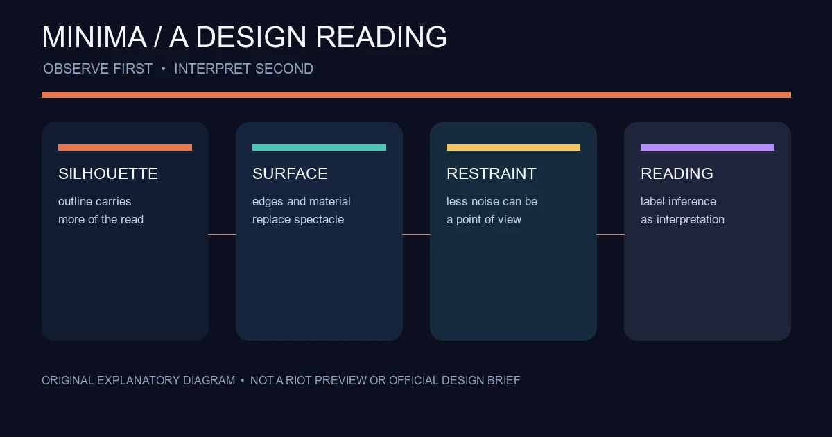
The Minima knife is interesting because it does not need a loud fantasy effect to make a point. Its appeal comes from restraint: a weapon that reads like equipment first and a collectible second. That sentence is an editorial reading, not a Riot design statement, so the useful review keeps the line between observation and interpretation visible.
This is not a price guide, an ownership database or a claim about when the knife returns to a store. The item preview in the VALORANT client is the place to confirm the current appearance. Riot’s official Arsenal gives the game’s base weapons short identity statements, while the public content catalog is the better place to check official names and catalog data when it is available. The catalog can lag a patch, so it is not a substitute for the current client.
First read: subtraction rather than spectacle
Many VALORANT melee cosmetics announce themselves through colour, animation, audio or a strong theme. A restrained design asks a different question: how much can be removed before the object stops feeling distinctive?
The Minima reading starts with surfaces and silhouette. The design feels controlled rather than decorative. That does not mean “plain” or “low effort.” It means the visual identity is carried by proportion, edges and material cues instead of a large effect. The knife can sit beside more elaborate collections without competing on the same terms.
That is analysis, not a sourced statement of intent. I could not verify a primary Riot article that calls this the Minima design brief. We can describe what appears in an official preview when we have one. We cannot turn a reaction to those choices into the developer’s intention.
The silhouette has to do more work
When a cosmetic is visually quiet, its outline becomes more important. Look at the item at a distance, reduce the preview mentally to a dark shape, and ask whether the handle, guard and blade still read as one object. This is a useful test for any melee cosmetic, not a claim that Minima has a special gameplay advantage.
The same test works in a match preview or screenshot, but screenshots need care. Perspective, lighting and first-person animation can make an item appear different from the Collection preview. A crop can also remove the context that tells readers whether they are looking at the base item, a variant or another knife entirely.
For an editorial review, capture the item from the same angle twice: once in a clean preview and once in the game if the account owns it. Record the patch and platform. If the item cannot be checked on the account used for the review, say so rather than filling the gap with an old repost.
“Minimal” does not mean neutral
The strongest version of the Minima idea is not that it has no personality. Minimalism can be a personality. A tightly controlled palette and limited visual noise can signal a preference for function, hardware or a more grounded science-fiction language. That is an inference from the visual choices.
It is also why the item may divide players. Someone buying a melee skin for a dramatic inspect animation may find the restraint uninteresting. Someone who wants a consistent loadout with less visual noise may see the same choice as the point. Neither reaction is an objective ranking.
Avoid turning that taste question into a fake consensus. “Best knife” is not a fact that can be sourced. “The design prioritises a quieter equipment-like read” is a defensible interpretation when the article shows the observations supporting it.
If the question is whether a cosmetic is yours, available or likely to return, use our store rotation and skin ownership guide. A visual analysis should not quietly become a purchase or availability claim.
What a responsible review should not invent
Do not attach an unverified story to the name. Do not say the knife was designed for a particular agent, faction or real-world manufacturer unless Riot has said so. Do not invent a production process, material, price history or rarity label from a community database. A wiki can help locate an old item name, but a primary source should carry claims about current availability and official identity.
The same rule applies to comparisons. It is fair to compare the visual priorities of Minima and another collection if the comparison is based on visible features. It is not fair to claim that one collection is “canon,” “competitive” or officially intended for a certain kind of player without a source. The Riot Terms of Service update is also a reminder that virtual content is licensed access, not ordinary ownership of an item.
Do not use a scraped shop image as evidence. Riot’s Legal Jibber Jabber page also makes rights and endorsement a separate question from whether an image looks useful. If you need a hero image, the rights-cleared media guide explains the safer choice: use a permitted source, document it, or create a clearly original explanatory diagram.
A useful way to decide if the design works
Ask three questions:
- Can a reader recognise the item from its outline without relying on a logo?
- Does the visual restraint remain legible during the inspect and equip animations?
- Does the design have a clear point of view, even if that point is quiet?
Those questions produce a better review than a list of adjectives. The answer may be yes for one player and no for another. That is fine. A cosmetic analysis is most useful when it explains the choice, names the uncertainty and lets readers decide whether the choice suits their collection.
Sources checked
The VALORANT Arsenal and Riot Developer Portal were checked on 2026-08-14 UTC for official weapon/catalog context. Riot’s Legal Jibber Jabber and Terms of Service update were checked the same day for rights and virtual-content cautions. No primary Riot design brief for the Minima knife was found in the checked sources, so the visual reading above is labelled as interpretation.